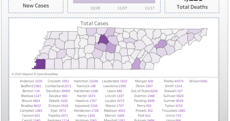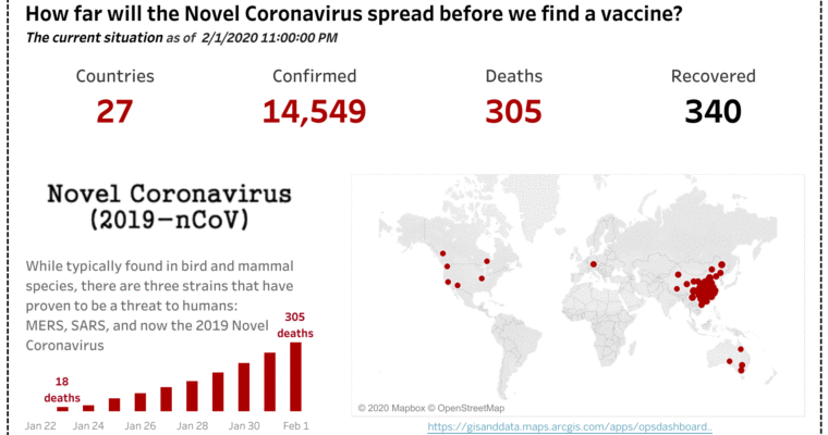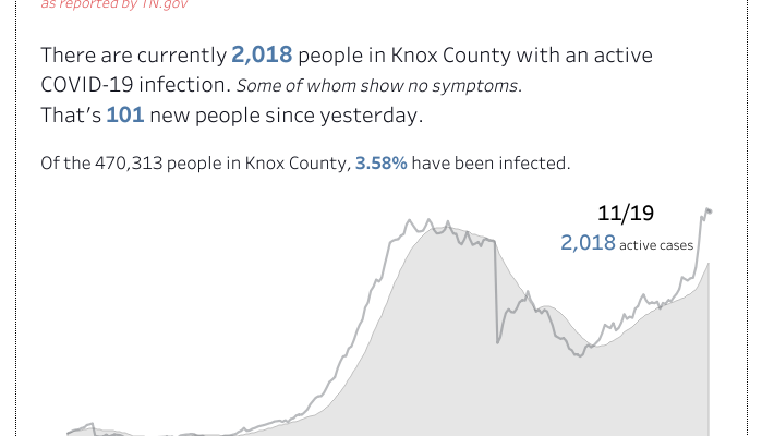
A simple way to explain the problem… COVID-19
Sometimes too much information causes brain overload. So I generated a VIZ with one graph… my thought was, “How many people are walking around already infected with COVID?” K.I.S.S. (Keep it simple stupid) Check it out here. Screenshot: