Making the world a better place by helping people understand their data.
October 24, 2018
2018 Tableau Conference – Tuesday
Keynote “Ubiquity”
Data analysis will soon be as common as the refrigerator
Pfizer pharmaceuticals 25,000 people on Tableau… 25,000 people?!
They also have an Interactive studio space to plan and explore dashboards with senior leadership.
Charles Schwab investors 1,200 financial consultants use their “MySales” dashboard.
Tableau Desktop Features in 2018.3
Dashboard buttons (no longer have to use actions)
Transparent zones
Heat maps
Tableau Desktop Feature in 2019.1
“Ask DATA” natural language plugin available to explorers and creators in version 2019.1 open a data source and just type “what are the gross profits by year” Save your results as a workbook and share.
Tableau Desktop Features in 2019.x
Drag one table out then click “Add related items” to pull in the remaining tables.
Bypass the LOD calc…No longer replicates data on join if the data is part of a dimension. Example: California having 8 billion people.
All rows In the dimension can display even if there are no records in the fact table…. basically a right outer join.
Tableau Server Update
25% of all tableau server installations are in the public cloud
AWS:
Tableau now has RedShift and Athena connections (I hadn’t realized RedShift was new)
AWS quick start for healthcare organizations with increased security for healthcare organizations.
Coming soon Amazon Sage Maker extension for machine learning
Tableau Online (tableau cloud):
Used by more than 10,000 organizations
2018.3 Server beta
Tableau prep conductor (flow scheduler) fully integrated with tableau server
Tableau Prep new features:
Data rolls and smart recommendations
Custom data roles
Highlighting the flow feature allows you to determine what table at field came from
Support for R And Python (example they used:Sentiment analysis with R)
2019.1 Server beta is now available with conductor and new data prep features
New Tableau Developer program
Free for any developer Includes a free Tableau online sandbox. Not much else was mentioned about this program, but you can sign up here. Get technical resources, Sample cloud, Documentation, Access to Tableau engineers.
Analytics for Malaria… http://visualizenomalaria.org/
The Tableau Foundation (helps non-profits) Smart use of data has reduced malaria related deaths by 85% over the last three years.
Overall the keynote was packed with information and some exciting new enhancements.
Session: Guest Speaker | Talithia Williams on power in numbers
Talithia is so motivational! I admire her energy.
She is working on a new show on PBS called “Nova Wonders” encouraging young people to work in stem fields.
Learned about “wisdom of crowds” and how this theory helps us provide statistical insights. https://www.pbs.org/wgbh/nova/video/the-wisdom-of-the-crowds
Session: Creativity in Design | Dashboarding with a magical mindset at Disney Merchandise
Inspire people to feel the magic when they open your dashboard
A clean design leads to Trust and increases usability
Beginning your design:
Determine what device the user will use to access your dashboard
iPad? If so consider the following:
Landscape or portrait?If designing for iPad tooltips will not be realistic to use
<Every iteration of a store performance dashboard was gone through here I can get the slides if anyone is interested.>
Be very selective of how much color you use, reserve color to make things “pop”
Aspire to create new fun tools
Design with intent
Test things out
Listen and adapt to the end users
Happy end users drive adoption, which drives impact, and provides results.
Session: Amp up your vizzes | Impactful dashboard design (Jedi Session)
(Got here a few minutes late and the room was full, I had to sit on the floor. But so worth it.)
Eye opener here: Asked myself, “Are you telling a story, or are you providing a tool for the end user to write their own stories.” Depending on the analytics maturity curve of your user. If you provide the latter they may not adopt your dashboard.
That said, stop reading now and check out the best reference tool for I learned about for planning your design:
http://ft-interactive.github.io/visual-vocabulary/ (non Tableau version)
https://public.tableau.com/en-us/s/gallery/visual-vocabulary
Principles:
Alway make a good first impression
– Don’t scare them away in the first few seconds.
Digestible & Clear
– Message should be clear, what are you trying to say?
Familiar
– User knows how to interact
Delight
– User experience
Does not Distract
– Viz should not distract from your message
Things to do to stick to these Principles:
Story Telling
Clarity: What is the key Question you are trying to answer? Do you understand the data? If building content for other people ask them why this dashboard is important to them, what action do you want it to drive. Ask why 5 times to determine if the dashboard will deliver the needed information. There should be an underlying narrative.
Engagement: Draw the user in
Stickiness .. . dashboard should be engaging
Exploration (choose your own adventure)
Use of Color
Color is the most powerful thing you can do of all design decisions
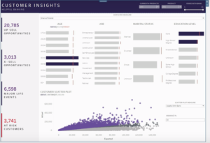
Dashboard Mike Cisneros Oil vs Gold
Two things to consider: Hue and Saturation (intensity)
Do not OVERUSE color
Design non data elements in shades of gray (Taylor Orwell) and then come back to add color to highlight your insight.This guide can help you.
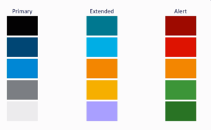
Choice of color… avoid alerting colors unless they are needed:
Other site you can use for color inspiration: https://www.canva.com/learn/100-color-combinations/ Neil Richards has a VIS on tableau public that will allow you to build your own color palette.
WHY TEXT MATTERS
Annotations can help people read non typical charts. Title and Subtitle help describe content. Too much text can be distracting
Layout and chart types:
See Visual Vocabulary above!
Don’t be tempted to float all of your charts… use “Padding”
(Version 2019.1 allows you to name your containers)
Example of color and padding…
Telling tales with data at The Wellcome Sanger Institute
This session emphasized the eye opener above.
I have more (post in progress)
 Data analysis will soon be as common as the refrigerator
Pfizer pharmaceuticals 25,000 people on Tableau… 25,000 people?!
They also have an Interactive studio space to plan and explore dashboards with senior leadership.
Charles Schwab investors 1,200 financial consultants use their “MySales” dashboard.
Tableau Desktop Features in 2018.3
Dashboard buttons (no longer have to use actions)
Transparent zones
Heat maps
Tableau Desktop Feature in 2019.1
“Ask DATA” natural language plugin available to explorers and creators in version 2019.1 open a data source and just type “what are the gross profits by year” Save your results as a workbook and share.
Tableau Desktop Features in 2019.x
Drag one table out then click “Add related items” to pull in the remaining tables.
Bypass the LOD calc…No longer replicates data on join if the data is part of a dimension. Example: California having 8 billion people.
All rows In the dimension can display even if there are no records in the fact table…. basically a right outer join.
Tableau Server Update
25% of all tableau server installations are in the public cloud
AWS:
Tableau now has RedShift and Athena connections (I hadn’t realized RedShift was new)
AWS quick start for healthcare organizations with increased security for healthcare organizations.
Coming soon Amazon Sage Maker extension for machine learning
Tableau Online (tableau cloud):
Used by more than 10,000 organizations
2018.3 Server beta
Tableau prep conductor (flow scheduler) fully integrated with tableau server
Tableau Prep new features:
Data rolls and smart recommendations
Custom data roles
Highlighting the flow feature allows you to determine what table at field came from
Support for R And Python (example they used:Sentiment analysis with R)
2019.1 Server beta is now available with conductor and new data prep features
New Tableau Developer program
Free for any developer Includes a free Tableau online sandbox. Not much else was mentioned about this program, but you can sign up here. Get technical resources, Sample cloud, Documentation, Access to Tableau engineers.
Analytics for Malaria… http://visualizenomalaria.org/
The Tableau Foundation (helps non-profits) Smart use of data has reduced malaria related deaths by 85% over the last three years.
Overall the keynote was packed with information and some exciting new enhancements.
Data analysis will soon be as common as the refrigerator
Pfizer pharmaceuticals 25,000 people on Tableau… 25,000 people?!
They also have an Interactive studio space to plan and explore dashboards with senior leadership.
Charles Schwab investors 1,200 financial consultants use their “MySales” dashboard.
Tableau Desktop Features in 2018.3
Dashboard buttons (no longer have to use actions)
Transparent zones
Heat maps
Tableau Desktop Feature in 2019.1
“Ask DATA” natural language plugin available to explorers and creators in version 2019.1 open a data source and just type “what are the gross profits by year” Save your results as a workbook and share.
Tableau Desktop Features in 2019.x
Drag one table out then click “Add related items” to pull in the remaining tables.
Bypass the LOD calc…No longer replicates data on join if the data is part of a dimension. Example: California having 8 billion people.
All rows In the dimension can display even if there are no records in the fact table…. basically a right outer join.
Tableau Server Update
25% of all tableau server installations are in the public cloud
AWS:
Tableau now has RedShift and Athena connections (I hadn’t realized RedShift was new)
AWS quick start for healthcare organizations with increased security for healthcare organizations.
Coming soon Amazon Sage Maker extension for machine learning
Tableau Online (tableau cloud):
Used by more than 10,000 organizations
2018.3 Server beta
Tableau prep conductor (flow scheduler) fully integrated with tableau server
Tableau Prep new features:
Data rolls and smart recommendations
Custom data roles
Highlighting the flow feature allows you to determine what table at field came from
Support for R And Python (example they used:Sentiment analysis with R)
2019.1 Server beta is now available with conductor and new data prep features
New Tableau Developer program
Free for any developer Includes a free Tableau online sandbox. Not much else was mentioned about this program, but you can sign up here. Get technical resources, Sample cloud, Documentation, Access to Tableau engineers.
Analytics for Malaria… http://visualizenomalaria.org/
The Tableau Foundation (helps non-profits) Smart use of data has reduced malaria related deaths by 85% over the last three years.
Overall the keynote was packed with information and some exciting new enhancements.